


Summary of case study
This case study is to apply skills developed through the Power BI course offered by Data Camp using a real-world problem. This is the second project assignment.
The Problem
In this case study, a fictitious client, Atlas Labs, have the primary goal of monitoring Key HR metrics on employees and understanding what factors impact attrition (Employee attrition is the naturally occurring, voluntary departure of employees from a company)
Project Approach
As we build their report, it is key to understand the process we will follow in our report development in PowerBI. The process is summarized below:
Step 1: Building the data model and analyzing the data
Requirements gathering
Data Connections
Data Transformation
Building the data model
Writing DAX measures
Step 2: Report Design
Branding
Defining the report layout
Building your report with chart visualizations
The Dataset: Requirements gathering, Data Connections and Data Transformation
For this case study, we will use the Kimball modelling approach as we model our data.
The Fact table stores the information about employee yearly reviews. We will also be working with multiple dimension tables to provide more context to the data we are working with. The final data model will follow a snowflake schema below.
The first step we will take is to open an empty PowerBI file and load and prepare our dataset. We will import all the CSV files and load them into PowerBI. Ensure that the data is clean. You may refer to this article on the expectations of clean data. Ensure you add either Fact OR Dim at the beginning of each table name, depending on the type of table it is.
Building the data model: Date dimension and relating tables
In any Power BI report, it is recommended to have a dedicated date table for accurate date and time reporting. In this stage, we will also model our data. This will enable us to connect our six different tables.
The first step we will take is to create a dedicated date table. Here is the DAX code we will use for the calculated Date Table. Next we will connect the following tables:
Connect the DimDate table to FactPerfomanceRating and the DimEmployee table. Note that the last relationship will be inactive because we cannot have more than one active relationship between the same tables at once, in PowerBI.
Connect the DimEducationLevel table to the DimEmployee table
Connect FactPerfomanceRating table columns (EnvironmentSatisfaction, JobSatisfaction, RelationshipSatisfaction and WorkLifeBalance) to DimSatisfactionLevel table and use EnvironmentSatisfaction as the active connection.
Connect FactPerfomanceRating table columns (SelfRating, ManagerRating) to DimRatingLevel and use the SelfRating column as the active connection.
Exploring the data
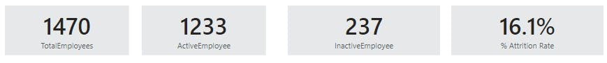
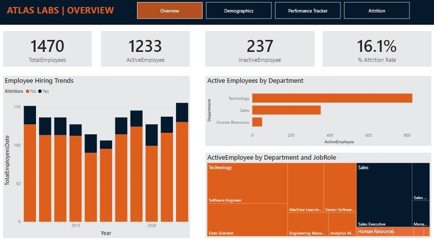
We will explore our data and produce high level metrics to understand the attrition at the company. Rename page 1 of your PowerBI file to “Overview” and create a new table called _Measures to store all the measures that we will create. We will then display these measures using the card visual in our overview page. Let’s create the measures below:
A measure to take count of all the employees
TotalEmployees = DISTINCTCOUNT(DimEmployee[EmployeeID])
Measures that take count of all employees that are currently active or inactive
ActiveEmployee = CALCULATE([TotalEmployees], DimEmployee[Attrition] = "No")
InactiveEmployee = CALCULATE([TotalEmployees], DimEmployee[Attrition] = "Yes")
Attrition Rate based on the measures we have created above.
% Attrition Rate = [InactiveEmployee]/[TotalEmployees]
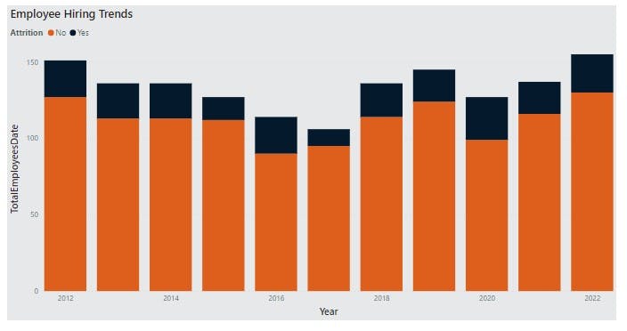
Hiring trends over time
Next, we will analyze Atlas Labs' hiring trends over time to see where they have had the biggest growth in employees.
We will create a new measure called TotalEmployeesDate that uses the CALCULATE() function on our TotalEmployees Measure and the USERELATIONSHIP function in the filter. You may read more about USERELATIONSHIP function here
TotalEmployeesDate =
CALCULATE (
    [TotalEmployees],
    USERELATIONSHIP ( DimEmployee[HireDate], DimDate[Date] )
)
Go ahead and create a stacked column chart. Add attrition to the legend on the chart to see the split of employees by active vs inactive. Change the X-axis from continuous to Categorical and Rename the chart to “Employee Hiring Trends”
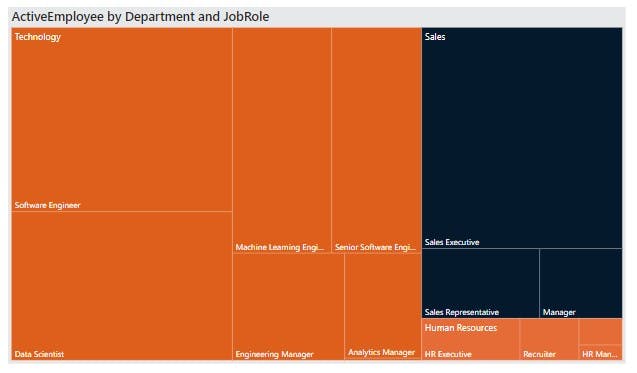
Analyzing departments and Job Roles
The next step, we will look into the typical roles department managers are hiring into the organization. This will enable every department to plan for new hiring requests in the future.
Create a clustered bar chart to show ActiveEmployees by Department. Rename this chart to “Active Employees by Department”. Add a treemap visualization to show Active employees by department and job role. Rename this chart to “Active Employees by Department and job role.”
Keys Insights so far
Atlas Labs has employed over 1,470 people
Atlas Labs currently employs over 1,200 people
The largest department so far is Technology
The attrition rate for employees leaving the organization is 16%
Is Atlas labs competitive enough as an employer?
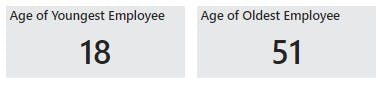
Demographics: age and gender
The next step is to develop a good understanding of the diversity and inclusion metrics. We will focus on employee age and gender. Let’s create a new page in the report called “Demographics”
Below we can see the minimum and maximum value for age displayed by card visuals.
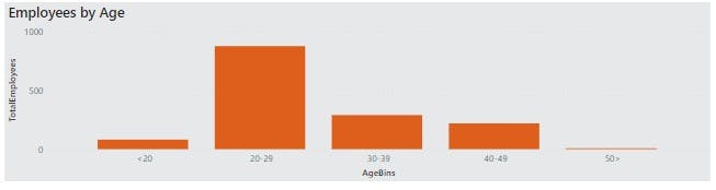
We want to take a closer look at the age distribution of employees so we will create a conditional column called AgeBins that separates employees' ages by bins in the following structure: <\20, 20-29, 30-39, 40-49, 50>.
=Table.AddColumn(#"Changed Type", "AgeBins", each if [Age] >= 50 then "50>" else if [Age] >= 40 then "40-49" else if [Age] >= 30 then "30-39" else if [Age] >= 20 then "20-29" else "<20")
Next, we will visualize our results. We will create a visualization that shows Employees by age and another visualization that shows Total employees value distribution across Age Bins and Gender.
It would be beneficial to add a page level filter that enables you to look at the report page based on whether an employee is currently active or not.
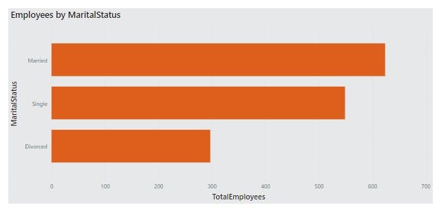
Marital Status and ethnicity
Next, we will be looking at further employee information regarding marital status and ethnicity. We will first visualize the count of all employees by marital status
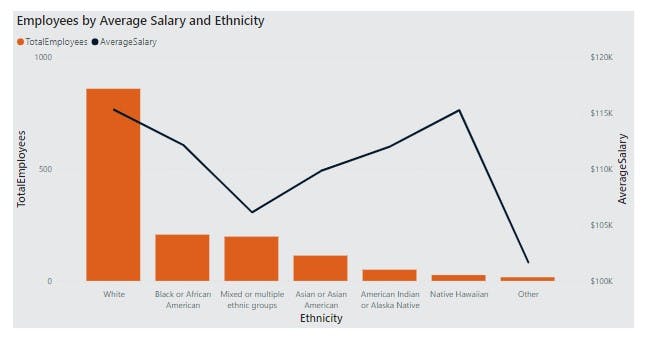
Next, we will create a measure, AverageSalary inside the measure table. This works out the average salary of all employees.
AverageSalary = AVERAGE(DimEmployee[Salary])
Below is a visualization of employees by their average salary and ethnicity.
Performance Tracker 1:
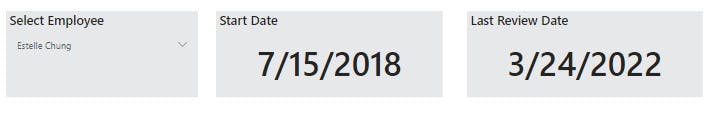
The HR Team would like to track the performance of the employees based on yearly performance reviews. We will create a new page in the report called “Performance Tracker”.
We will add a slicer with employee full name which has single select and search enabled. We will go on to add a card which shows selected employee start date, last review date and next review date
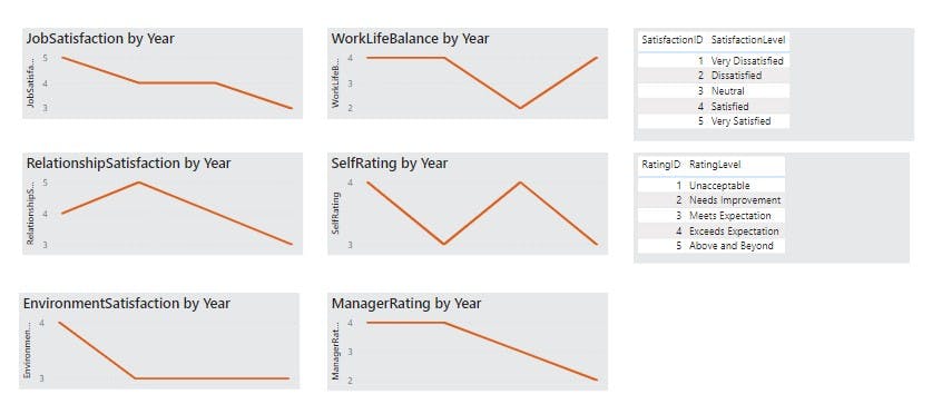
Performance Tracker 2
Next we would like to take a closer look at individual review ratings. We will create satisfaction metrics inside the _Measures table and visualise them.
EnvironmentSatisfaction = CALCULATE(
MAX(FACTPerformanceRating[EnvironmentSatisfaction]),
USERELATIONSHIP(FACTPerformanceRating[EnvironmentSatisfaction], DimSatisfiedLevel[SatisfactionID]))
JobSatisfaction = MAX(FactPerformanceRating[JobSatisfaction])
RelationshipSatisfaction = CALCULATE(
MAX(FACTPerformanceRating
[RelationshipSatisfaction]),
USERELATIONSHIP(FACTPerformanceRating
[RelationshipSatisfaction], DimSatisfiedLevel[SatisfactionID])
)
More Insights uncovered
Majority of employees are between 20-29 yrs
- Atlas Labs employs 2.7% more women than men
Employees who identify as
Non Binary makeup 8.5% of total employees
White have the highest average salary
Mixed or multiple ethnic groups have one of the lowest average salaries
From the charts we’ve built, we can also see that the employees that have been considered frequent travelers have the highest attrition rate despite only making up 19% of the total hires.
Creating a cohesive report
The final step is preparing to deliver our report to the key stakeholders at Atlas Labs. We will focus on delivering insights on attrition and what factors affect employee retention.
Here is the Overview Dashboard.
Here is the final report delivered.
Thank you for reading
Author: Gcinithemba Sherilyn Maphosa
Data Wired